STUDIO ÉPÉE Identity
STUDIO ÉPÉE is an entertainment design and graphic design studio.
The brand name is ÉPÉE .
It is one of the three fencing sports events (Épée, Sabre, and Fleuret).
Of the three events, Épée is the only full-body target and requires considerable patience, endurance, moderation and accuracy.
STUDIO ÉPÉE also targets all genres that can be applied and absorbed,
The brand name is ÉPÉE .
It is one of the three fencing sports events (Épée, Sabre, and Fleuret).
Of the three events, Épée is the only full-body target and requires considerable patience, endurance, moderation and accuracy.
STUDIO ÉPÉE also targets all genres that can be applied and absorbed,
just as Épée targets the whole body.
As it is an entertainment industry that is more fashionable than any other industry, we read the flow of the world shrewdly to catch the 'gap' of the public.
Through patience, endurance, and moderation, we will find what the public wants and precisely poke the gap.
STUDIO ÉPÉE pursues a distinct commercial art.
It aims to harmonize artistry while following commerciality and popularity.
Pursuing authenticity through consistent messaging in branding.
Our studio will show you delicate and detailed details, a combination of glamour and moderation, and branding like luxury.
STUDIO ÉPÉE 아이덴티티
STUDIO ÉPÉE는 브랜딩, 그래픽 디자인 스튜디오입니다.
브랜드 네임은 ÉPÉE (에페)로,
펜싱 스포츠의 하나이며 상당한 인내심, 지구력, 절제력, 정확성을 요구합니다.
펜싱 스포츠의 하나이며 상당한 인내심, 지구력, 절제력, 정확성을 요구합니다.
STUDIO ÉPÉE 도 마찬가지로
대중의 '틈'을 찌르기 위해 세상의 흐름을 기민하게 읽습니다.
인내심, 지구력, 그리고 절제를 통해 대중이 원하는 틈을 찾아내 찌를 것입니다.
STUDIO ÉPÉE는
브랜딩에 있어서 일관성있는 메시지를 통한 진정성을 추구합니다.
브랜딩에 있어서 일관성있는 메시지를 통한 진정성을 추구합니다.
섬세하고 정확한 디테일, 화려한
펜싱같은 브랜딩을 추구합니다.
펜싱같은 브랜딩을 추구합니다.
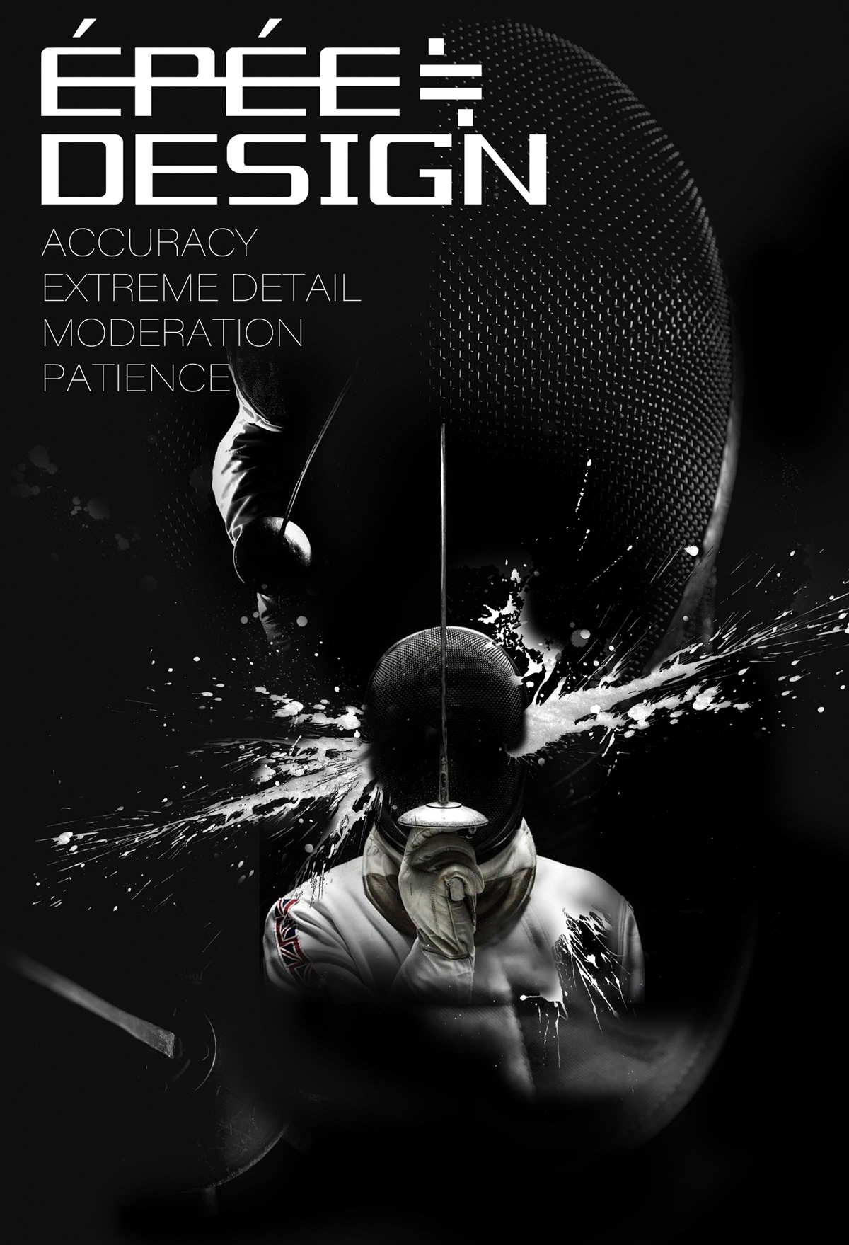
WHY ÉPÉE?
This one graphic illustrates the identity of the studio.
Épée is the only full-body target and requires considerable
patience, endurance, moderation and accuracy.
we read the flow of the world shrewdly to catch the 'gap' of the public.
Through patience, endurance, and moderation, we will find what the public wants and precisely STAB the gap.
Through patience, endurance, and moderation, we will find what the public wants and precisely STAB the gap.
이 그림은 스튜디오의 정체성을 보여줍니다.
에페는 유일하게 전신을 표적으로 하며 상당한 인내심, 지구력, 절제력, 정확성을 요구합니다.
저희 역시 대중의 '틈'을 잡기 위해 세상의 흐름을 기민하게 읽고,
인내와 인내, 절제를 통해 대중이 원하는 것을 찾아내고 그 간극을 정확히 찌를 것입니다.
에페는 유일하게 전신을 표적으로 하며 상당한 인내심, 지구력, 절제력, 정확성을 요구합니다.
저희 역시 대중의 '틈'을 잡기 위해 세상의 흐름을 기민하게 읽고,
인내와 인내, 절제를 통해 대중이 원하는 것을 찾아내고 그 간극을 정확히 찌를 것입니다.

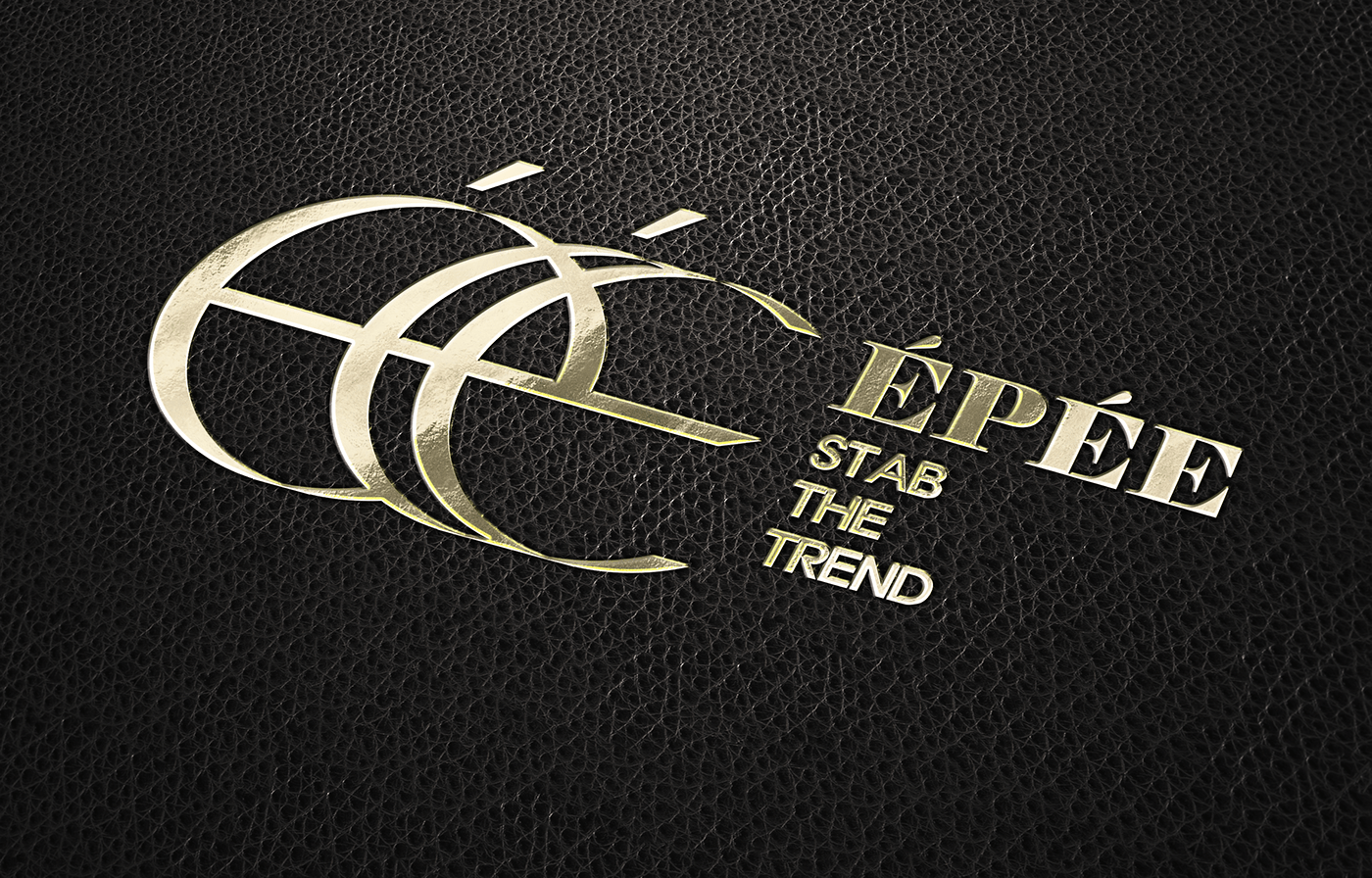
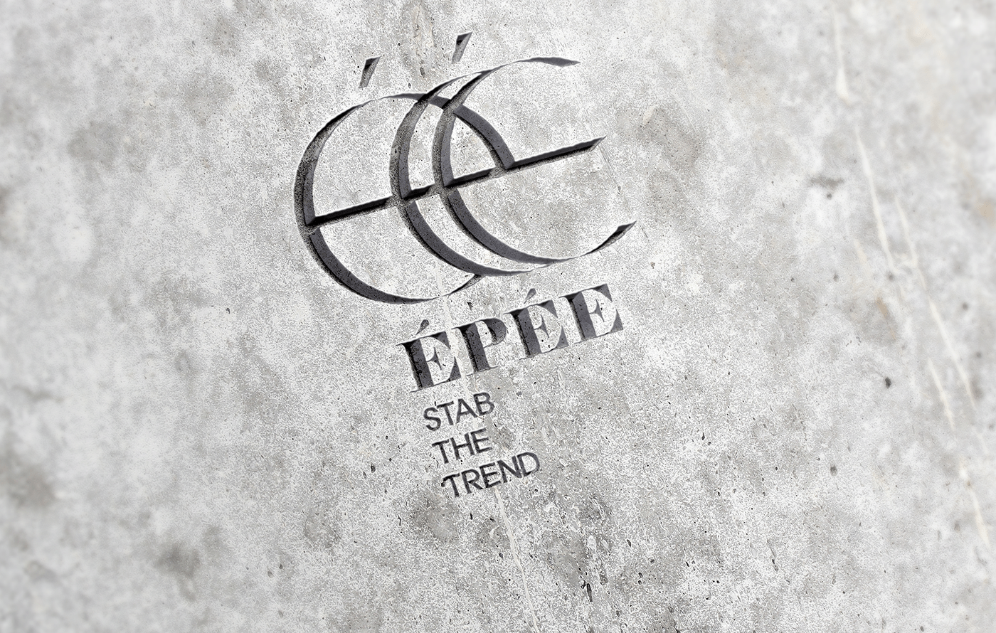
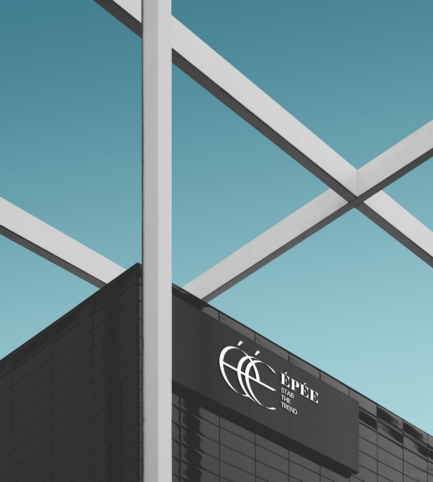
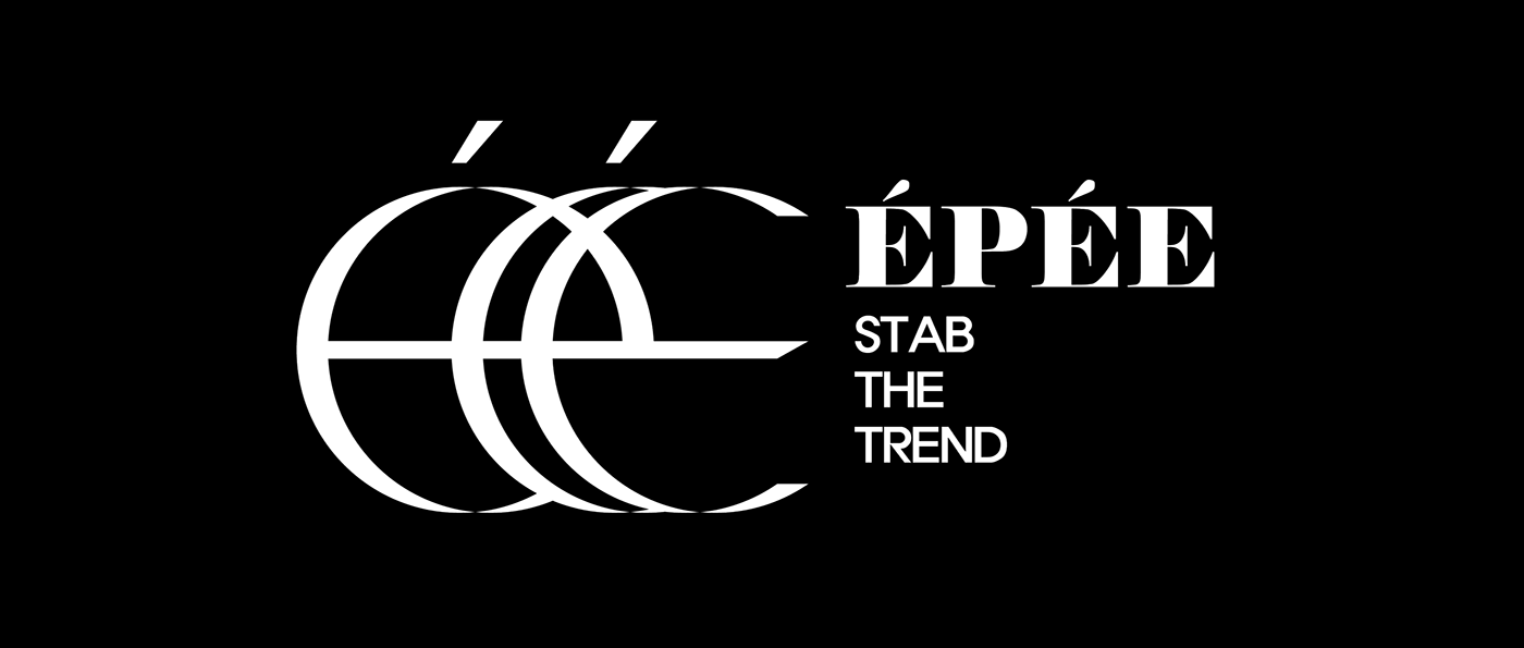
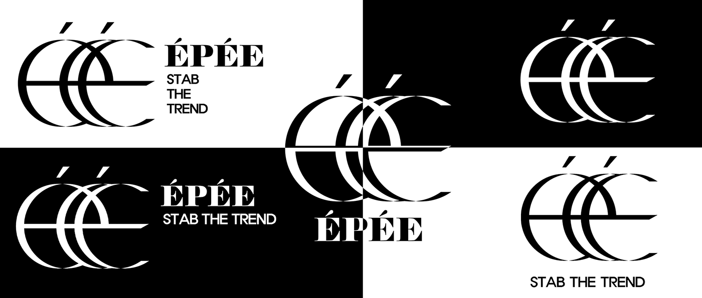
BRAND MARK
The brand marks represented the exact capture of the public's needs through a line through which the alphabet of ÉPÉE was placed in a formative manner.
At the same time, the shape of the alphabet that wraps around the line seems to wrap up the sword that penetrates the center.
At the same time, the shape of the alphabet that wraps around the line seems to wrap up the sword that penetrates the center.
브랜드 마크는 알파벳을 조형적으로 배치하면서도 가운데를 관통하는 선을 통해
대중의 니즈를 정확히 찔러 잡아냄을 의미합니다
동시에 선을 감싸는 알파벳의 형태는 중앙을 관통하는 칼을 감싸 올라가는 듯한 형태로 보이기도 합니다.
대중의 니즈를 정확히 찔러 잡아냄을 의미합니다
동시에 선을 감싸는 알파벳의 형태는 중앙을 관통하는 칼을 감싸 올라가는 듯한 형태로 보이기도 합니다.
variation
LOGO ANIMATION
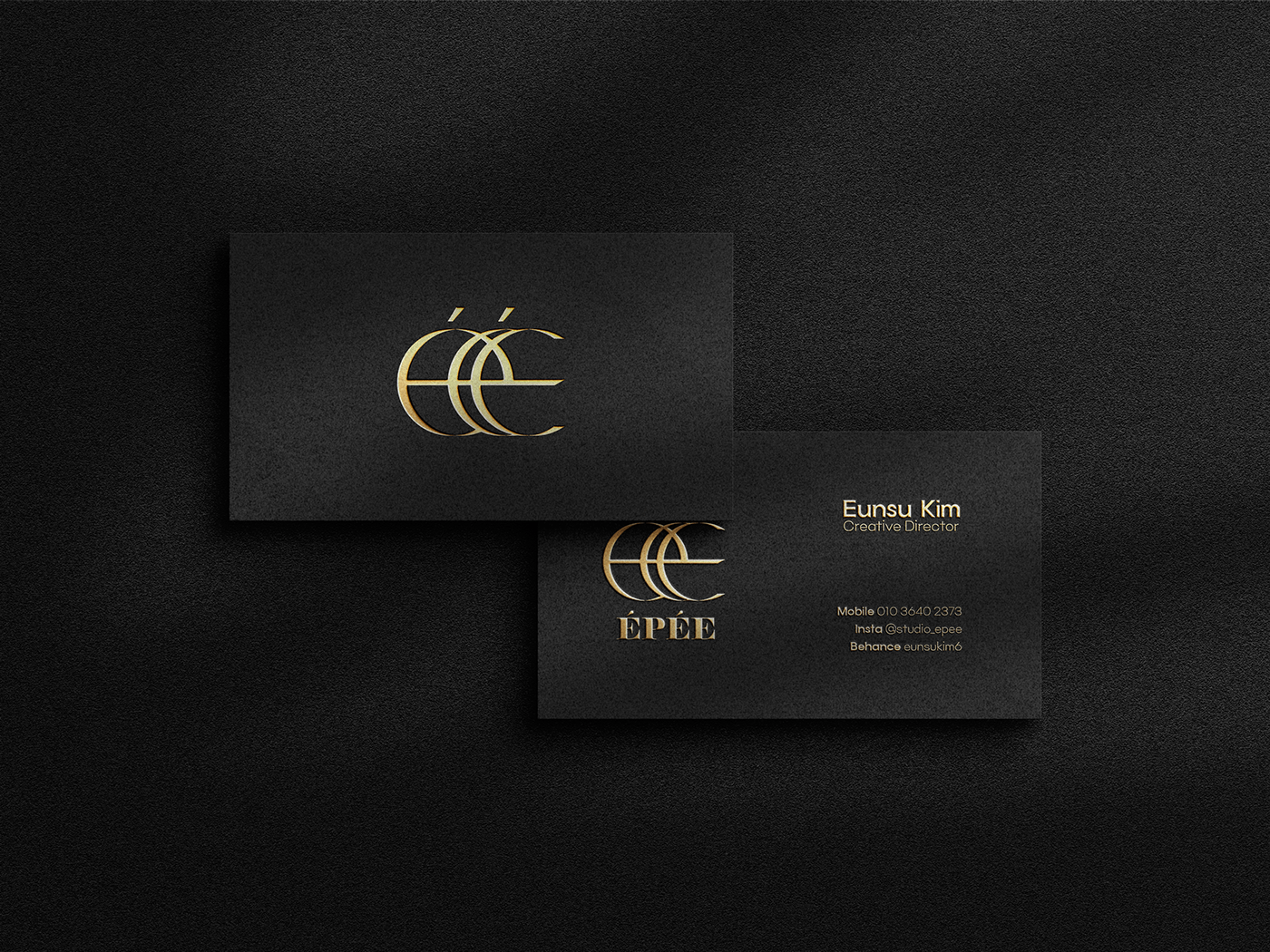
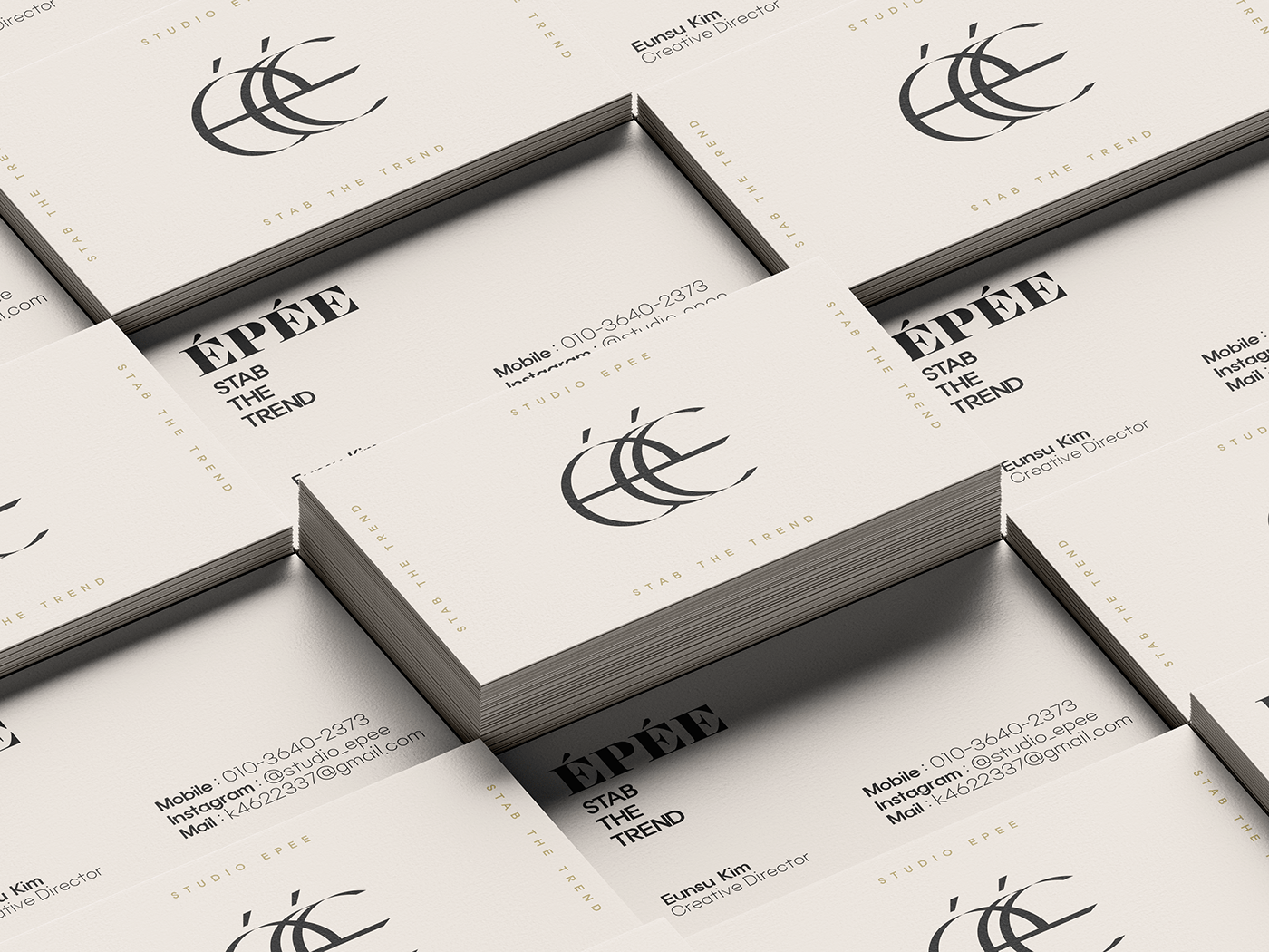
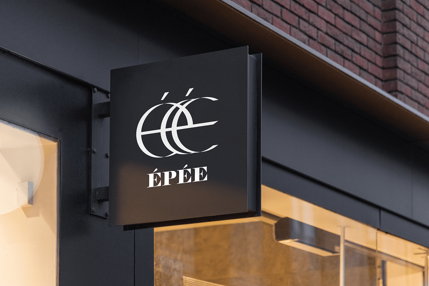
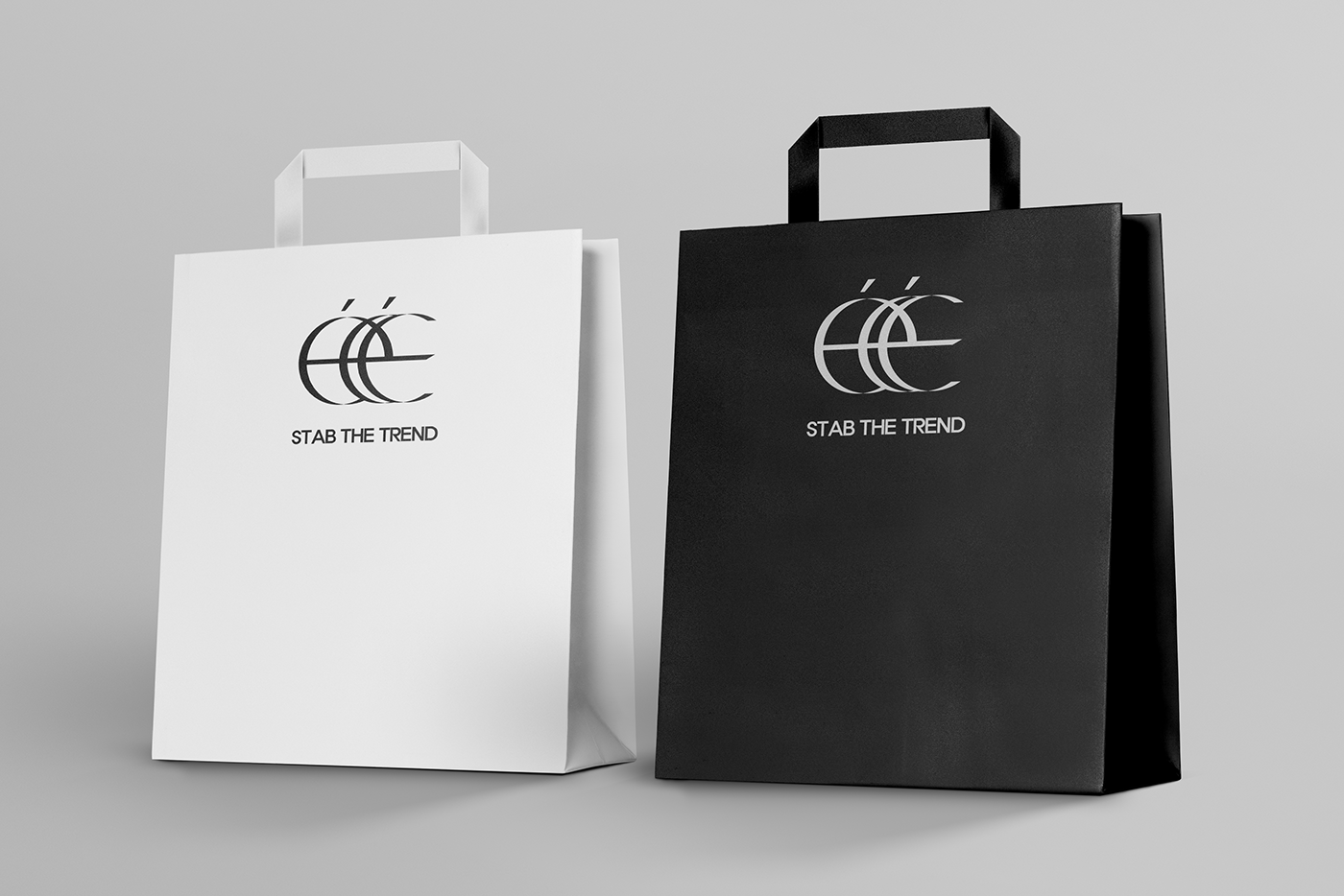
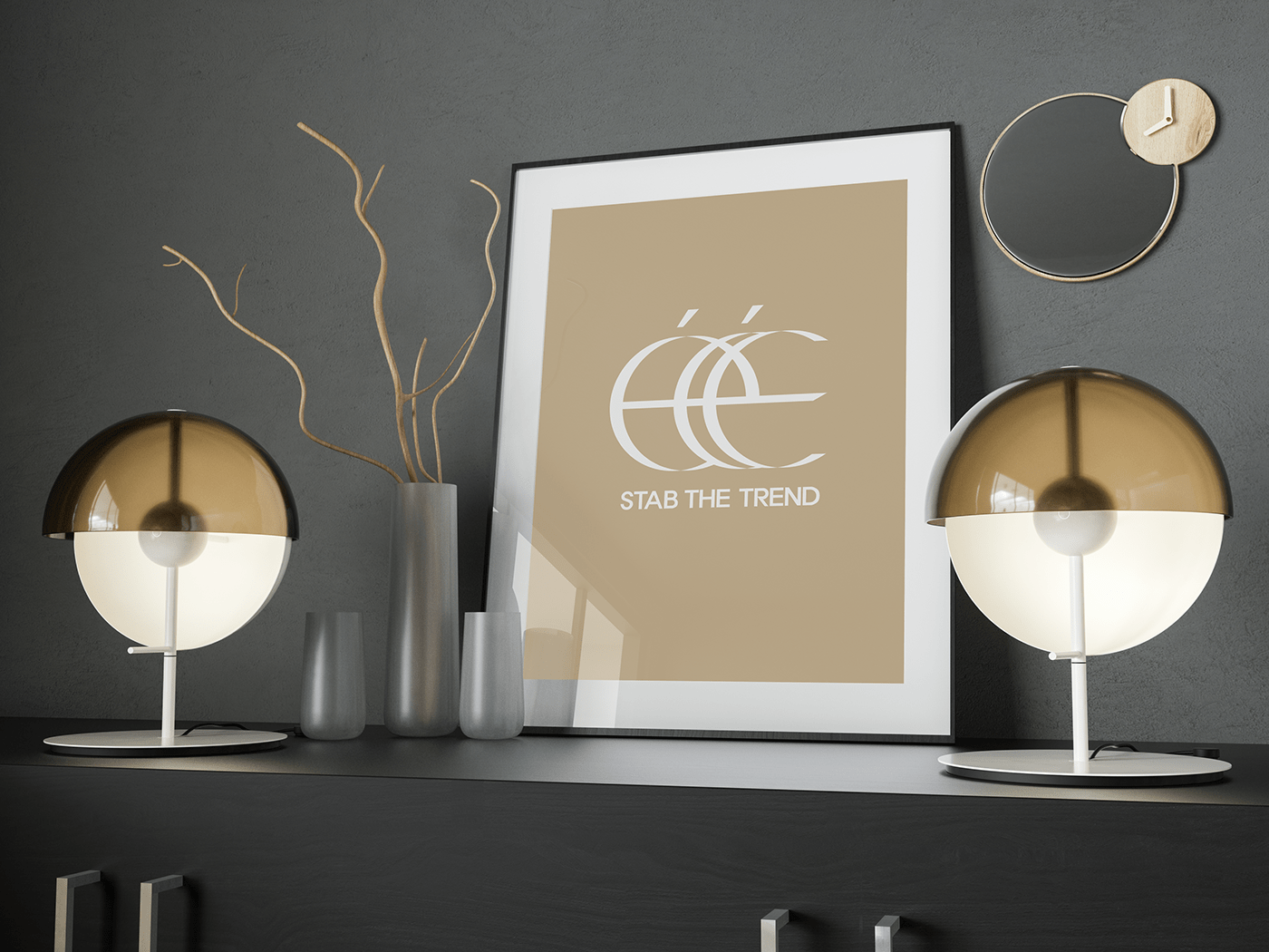
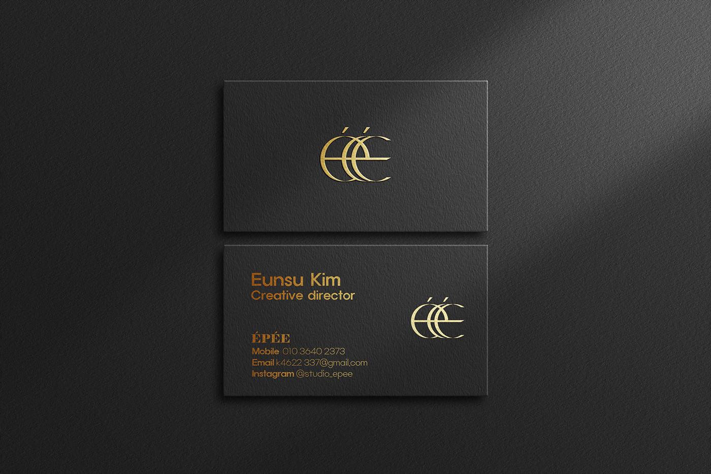
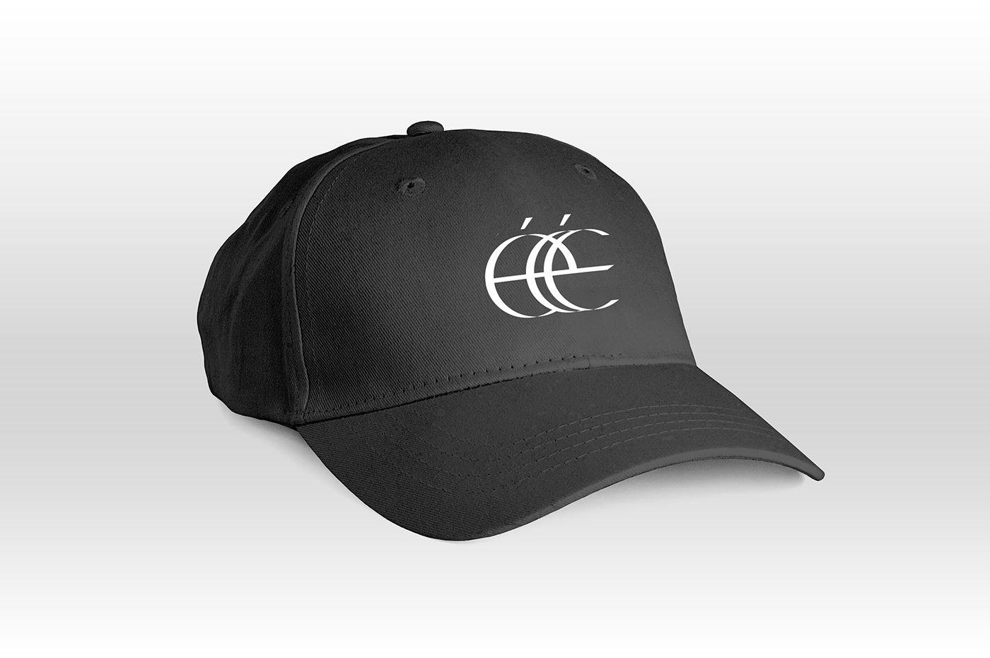
Applications